Slider Revolution is a WordPress plugin for creating slideshows. It’s a great flexible plugin, one of the most popular out there and we use it a lot. But nothing is perfect. One specific flaw in this plugin is the lack of option to hide a slide on desktop screens. This is odd because you can hide a slide on mobile, you can hide an individual layer of a slide on mobile or desktop, but you can’t hide an entire slide on desktop.


Problem
Why would anyone need to hide a slide on large screens? Working on the Facets of Beauty website, we were building a slider for the homepage. We’re using a series of images with the subject on the left and space on the right hand side for a right aligned hero-title. On tablet and phone screens there isn’t enough room to align the title on the right, so we centred the text and used images with the subject in the centre.
This necessitates the use of two different groups of slides. We can hide slides on mobile, so on mobile screens the slideshow only displays the correct slides. On desktop we’re stuck showing both mobile and desktop slides.
We have searched the plugin code for hiding slides on mobile for a handy hook or filter that would allow us to add some logic of our own, but there isn’t one. This is particularly annoying, as it would’ve taken only a few minutes to write the necessary code. So, instead, we’ll need to do some lateral thinking.
Workaround
Our workaround was instead of creating two slides and setting a background for each, we created one slide and added two layers. Each layer functions as a background. Since layers can be hidden on desktop or mobile we simply set one layer to be visible on desktop and the other to be visible on mobile.
Here’s how to do it:
- Create a new slide in your slider of choice.
- Add two image layers. Make sure you’re using big enough images.
- In the Main Background tab of the slide settings don’t set a background.
- For each layer set the following:
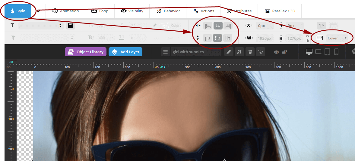
- Under the Style tab

- Set Cover Mode to ‘Cover’.
- Centre the layer vertically and horizontally.
- Under the Visibility tab select the devices you want the layer to display for on Visibility on Devices. In our case we set the girl with the cloth to be visible on phones and tablets, and the girl with the sunnies to be visible on desktops and laptops.

- Under the Behavior tab, set Align to ‘Slide Based’. Activate Auto Responsive.

- Under the Style tab
That’s pretty much it. You can see the results by viewing the Facets of Beauty homepage slideshow on mobile and on desktop PC.
In our situation we have all the text on the Static/Global Layers slide, so each slide is just a background image. Your situation may be more complex. These adhoc backgrounds are a little less flexible than the actual slide background functionality. For example positioning the backgrounds anywhere other than centre can cause white space appearing where you probably don’t want it.
Alternative
An alternative solution would be to create two slideshows, one for desktop and one for mobile. In the theme’s page-template you could then write some code to detect whether the website is being viewed on a mobile device or a desktop device and load the relevant slider. You can see an example of this solution is action in this Stack Overflow question.
This workaround is stupid
Agreed. We’ve asked ThemePunch to add this feature to the plugin and they’ve apparently added it to their request list. Until it’s implemented, hopefully someone finds this workaround useful. If you do, feel free to praise us in the comments.


8 Comments
Joshio58
January 11, 2018 at 9:07 am
Thanks for posting this as I am in the same boat. I agree on the “THIS WORKAROUND IS STUPID” section … There should really be an option for hiding on desktop … After all this is a premium plugin. Also thanks for adding the stack overflow link … I may end up running with that option.
David
March 4, 2018 at 4:59 pm
First method works, but just partly. Yes, slider is disappeared on desktop, but there is same size empty space instead of it.
jamesjones
March 5, 2018 at 3:32 pm
Thanks for the comment David. You need to have one image for desktop and one for mobile on a single slide. If you just have one image for mobile and hide it for desktop you won’t have anything on desktop. If you’re wanting the slider to not display at all on desktop, then that’s a different problem. In any case, it’s a flawed solution. On the website I used as an example I ended up making the mobile show just one slide because the transitions using this solution were janky.
Femi
October 15, 2018 at 3:35 am
how to hide a slide on android devise and hide another slide on iphone devise?
Scottydogg
April 12, 2019 at 12:59 am
I disagree: this workaround is not stupid. It worked great! Setting those Behaviour and Style options caused my images to fill the viewports on desktop and mobile just like a background image would. THANKS!!
James
April 23, 2019 at 2:05 am
is it possible to hide slider revolution on desktop and shown on mobile?
WI
April 20, 2021 at 5:21 pm
Similar to the Stack Overflow solution, can’t we use a CSS media-queries to hide desktop div containing desktop slider, and show mobile div containing the mobile slider?
Japra
November 13, 2023 at 1:08 pm
Yes, we need a feature hiding slide on desktop.
Leave a reply